-
Government
-
Column 1
- Contact the City
- Boards and Committees
- Planning Commission
- Budget Committee
- Community Center Advisory Board
- Park and Recreation Board
- Traffic Safety Advisory Board
- Audit Committee
Column 2
Column 3
- Community
-
Column 1
- About
- City of Gladstone
- Contact the City
- Chamber of Commerce
- Gladstone Historical Society
- Gladstone Community School
- City Parks
- Parks
- Gladstone Community Gardens
- Gladstone Pickleball Club
Column 2
- City Calendar
- Recreation
- Parks & Trails Directory
- Recreation Programs
- Recreation Events
- Community Events
- Community Documents
- Community Application Forms
Column 3
- Business & Services
- I Want To
-
Column 1
- Job Opportunities
- Events and Meetings
- Agendas & Minutes
- Calendar
- View GIS Mapping
- Emergency Management
- Flash Alert Subscription
Column 2
- Contact the City
- Submit a Request or Concern
- Report a Code Violation
- Contact the City
- Community Application Forms
- Gladstone Volunteer Opportunities
- Gladstone Municipal Code
- Gladstone Burn Regulations
Column 3
- Social Media
- Nextdoor
- In the News
- City Newsletter
- City News
- City Projects
- Online Payments
-
Gladstone Brand and Tourism Strategy
WHY THESE COLORS
These colors were originally chosen to represent the three most critical aspects of Gladstone as it relates to tourism. The City’s consultant, Rotator, explored a range of color combinations following the feedback they received from City stakeholders in the first round, and returned to this solution for several reasons. We found that changing the top bar to any color other than blue resulted in the river metaphor being lost. When exploring color schemes more in line with the Nature’s Neighborhood concept, they did not pack as much visual punch (not good for wayfinding). They also began to look homogeneous with neighboring brands like Oregon City and Travel Oregon (not good for setting Gladstone apart). We believe this suite of colors best tells Gladstone’s story while also speaking to the vibrancy it aspires to imbue.
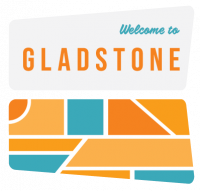
WHY THESE SHAPES
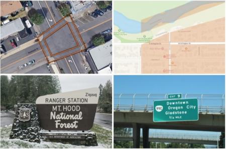
The iconic mark does several things. For one, it echoes the unique shape of the crosswalks at the intersection of Portland Ave and Dartmouth — arguably the most critical juncture in the downtown core given its proximity to local businesses and connections with the riverfront and McLoughlin Boulevard. The segmented shapes within it resemble a river running alongside city blocks. Follow the shapes counterclockwise and it reads as the letter G. It can also be interpreted as an abstract stone, much like the ones seen along the shores of the two rivers.
Outdoor recreation is a critical tourism component for Gladstone. To tie this into the brand, we pulled in elements from the Nature’s Neighborhood concept by rounding the outer corners on the logo mark. This helps make a subtle visual connection with the iconic signs found at nearby parklands. The hand-painted typeface (Calafia) and contrasting color block at the top also reinforce the connection. Rounding the corners also has the effect of softening the mark, thus making it feel more friendly and approachable. Interstate is the typeface used on street signs all across the country. Using this as part of the Gladstone brand adds to the road trip sentiment that goes hand in hand with National Parks and Forest culture.
WHY THESE PATTERNS & ELEMENTS
We envision this pattern of segmented shapes going a long way for the Gladstone brand. The shapes’ liveliness signals a sense of motion and activity while the pattern as a whole reinforces the neighborhood feel of the city in the way it resembles a bird’s eye view of dynamic city blocks. Furthermore, this pattern can be easily replicated to form an infinite amount of combinations, giving it considerable flexibility and longevity. The rounded corners and angled sides of the logo mark can be implemented and modified for hardscape elements such as signs and banners. Together, these pieces come together to form a cohesive kit of parts that is both playful and professional.
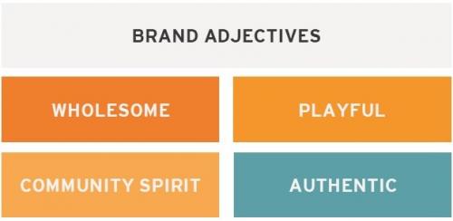
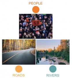
WHY THESE ADJECTIVES?
WHOLESOME: One of Gladstone’s greatest assets is the charm of small town life. We want to leverage this and focus our efforts on attracting families as our target tourism audience. We want to help them feel a sense of belonging, safety, and opportunity when they visit. PLAYFUL: From casting lines out into the river to racing an RC car around the track, there are many ways to play in Gladstone. We want to promote discovery by championing all forms of play and encouraging visitors to try something new. COMMUNITY SPIRIT: A city that loves itself is a lovable city. We want to celebrate the people and places of Gladstone and also hold the door open for visitors to join the fun. Just as rivers connect in Gladstone, so do people. Let’s showcase this. AUTHENTIC: Gladstone is not Portland; nor does it want to be. It’s proud of who it is and where it comes from. Rather than expend energy trying to outdo other cities, Gladstone should move forward with confidence and optimism as it tries to be a better version of itself.